Product Designer
Figma
Aug 2025
6 weeks

So…what is the problem?
In 2025, over 250,000 people attended Coachella, yet fewer than 10% used the official app — even though every ticket package included a dedicated card urging attendees to download it for a smoother festival experience.
Reviews from users who have used the app (2025 version):
In the app store, nearly 50% of ratings are between 2 and 3 stars.
On Reddit, although there is no formal rating system, most posts express negative sentiment.
Why did you give up on the App?
We conducted comprehensive research to ensure that we fully understood why attendees ultimately chose not to use the app.
Let's take a look at two representative user personas and their end-to-end user journeys:
User 1: Jen (First-Time Coachella Goer)
"I want everyone in our group to be on the same page — no stress, no clashes, just a perfect weekend!"
Jen's User Journey
Cannot export entire weekend schedule at once
Excited 🥰 → Slightly slow down 😞
No interactive sharing or sync collaboration
Slightly let down 😞 → Disappointed 🙁
Chaotic group coordination
Disappointed 🙁 → Overwhelmed 😩
User 2: Casey (Hidden Gem Digger)
"Coachella is my chance to discover new artists. I wish the app helped me dive deeper into the music."
Only social links shown in artist bio, no music embedded; has to switch to another app
Curious 🤓 → Disappointed 😑
Emotion Analysis
The following is user's emotion shift at various stages.
Identifying key intervention points
Based on user journeys and emotional analysis, we identified several key moments in the journey where targeted design interventions are most needed.
Ideate
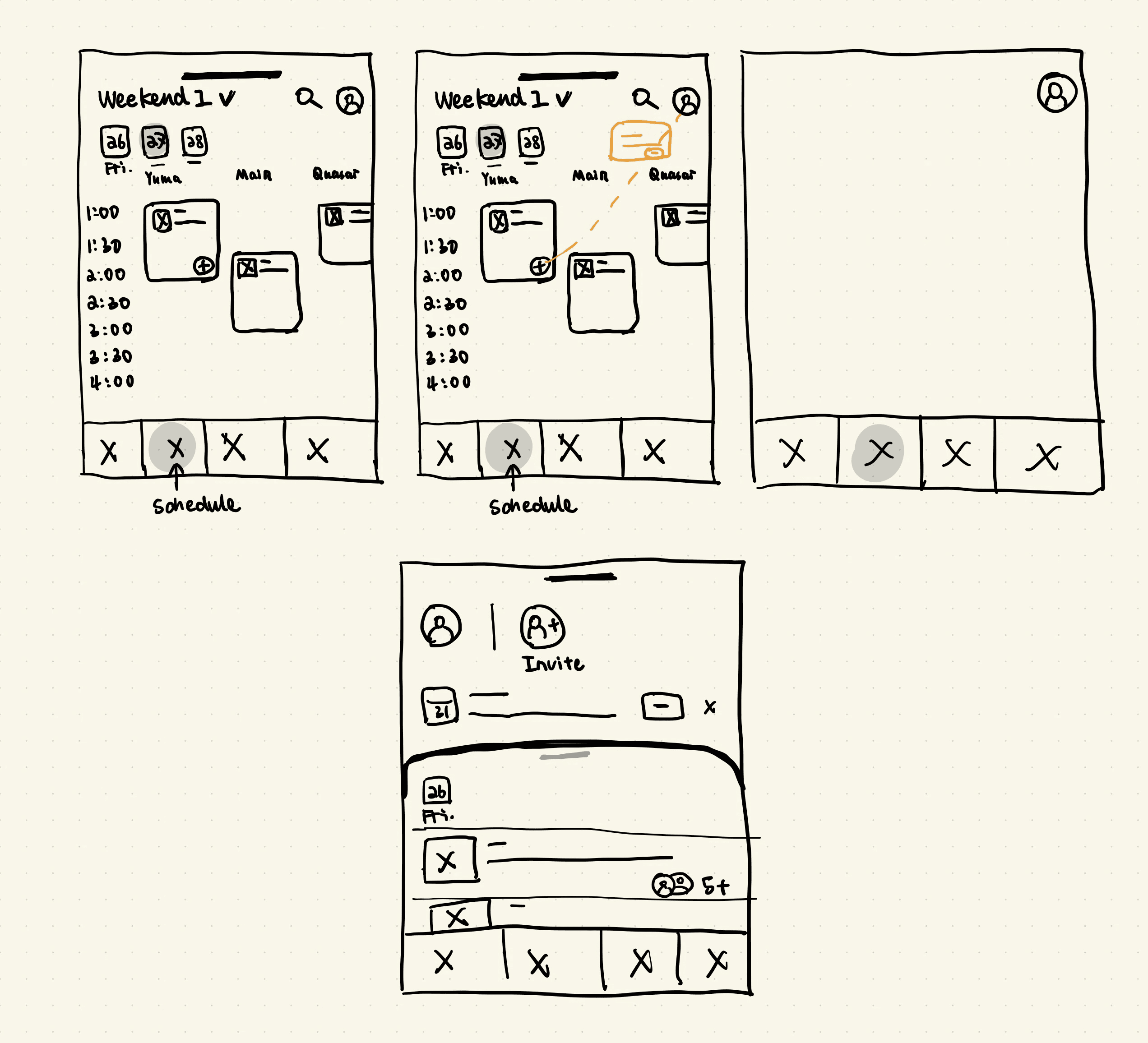
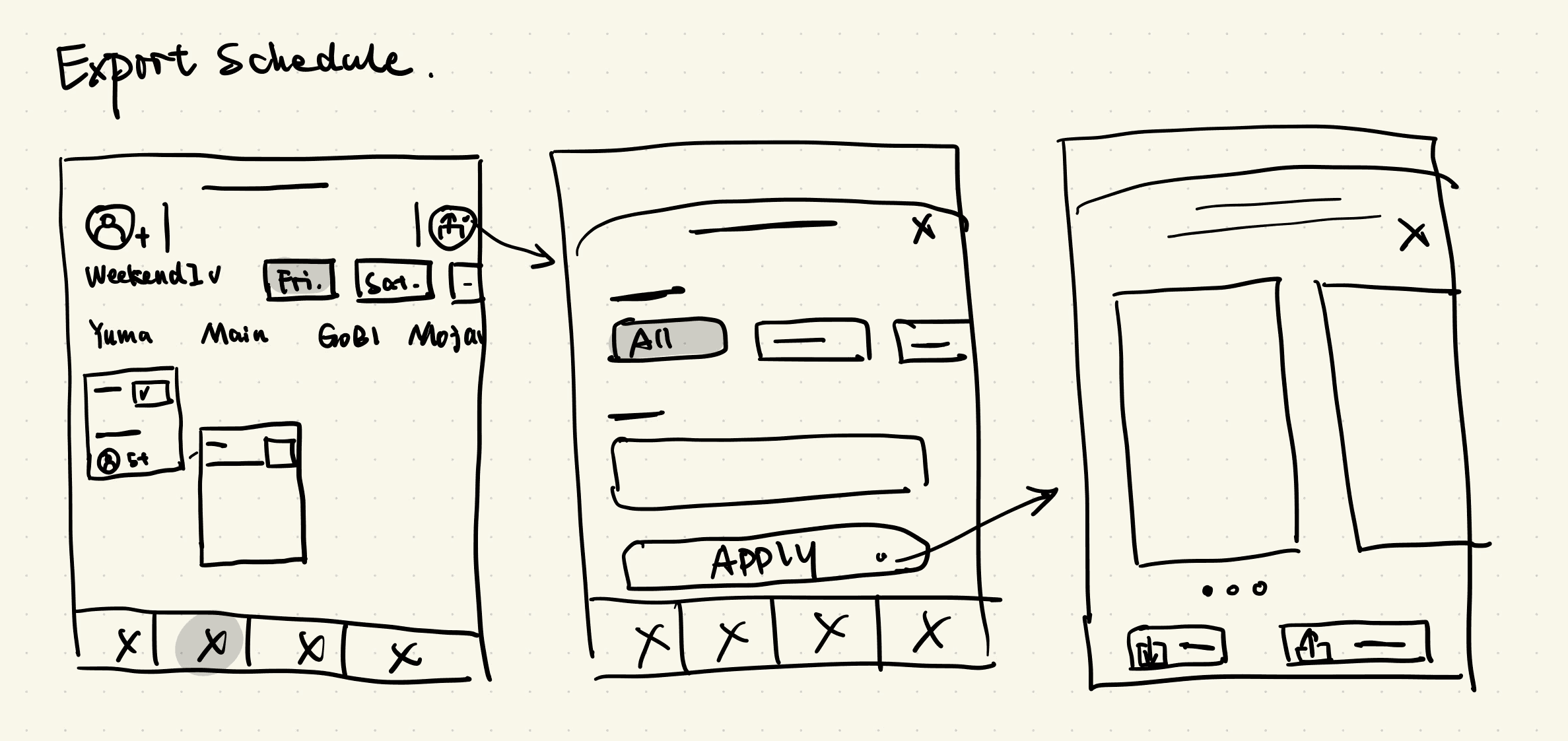
Low-fidelity
Sketch
Mid-fidelity
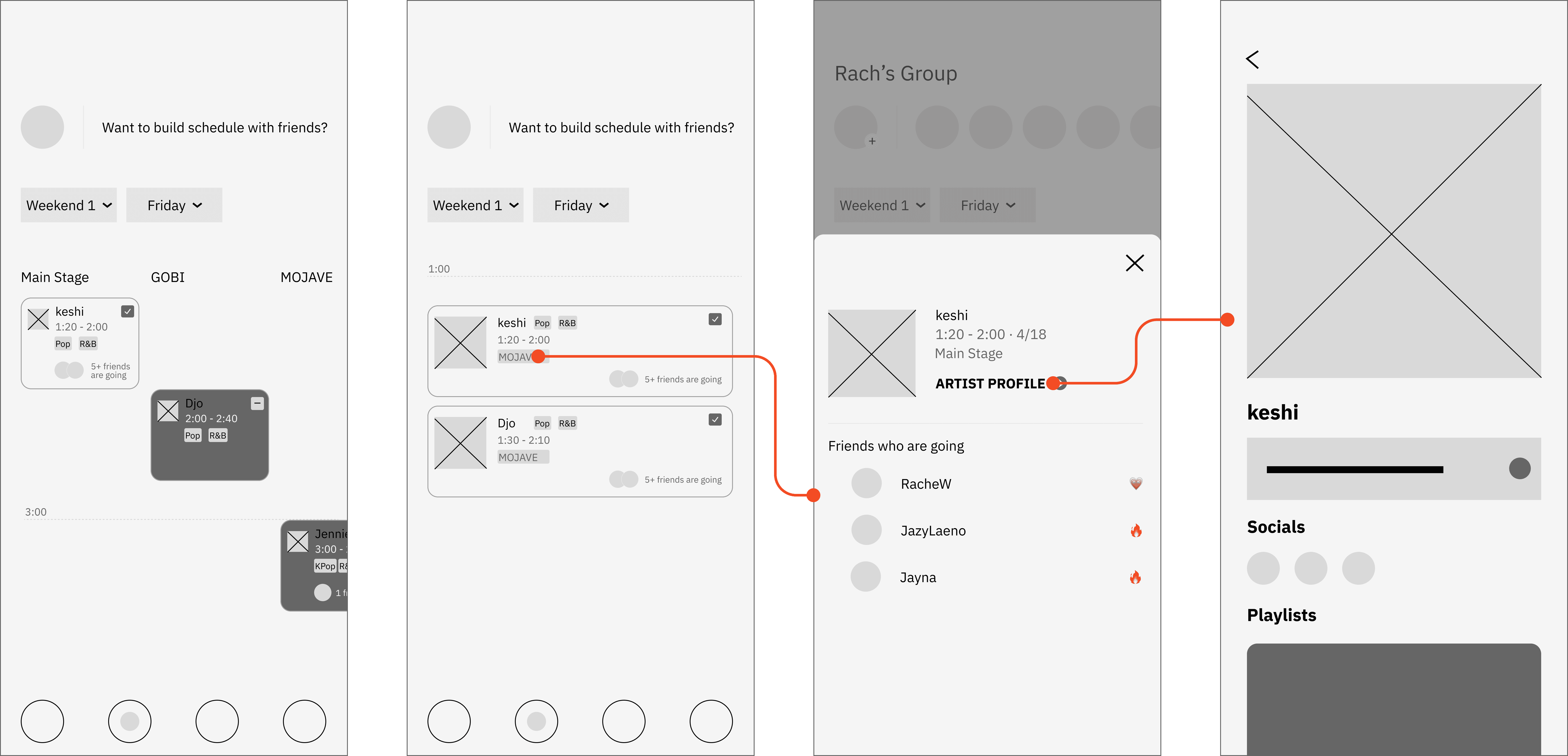
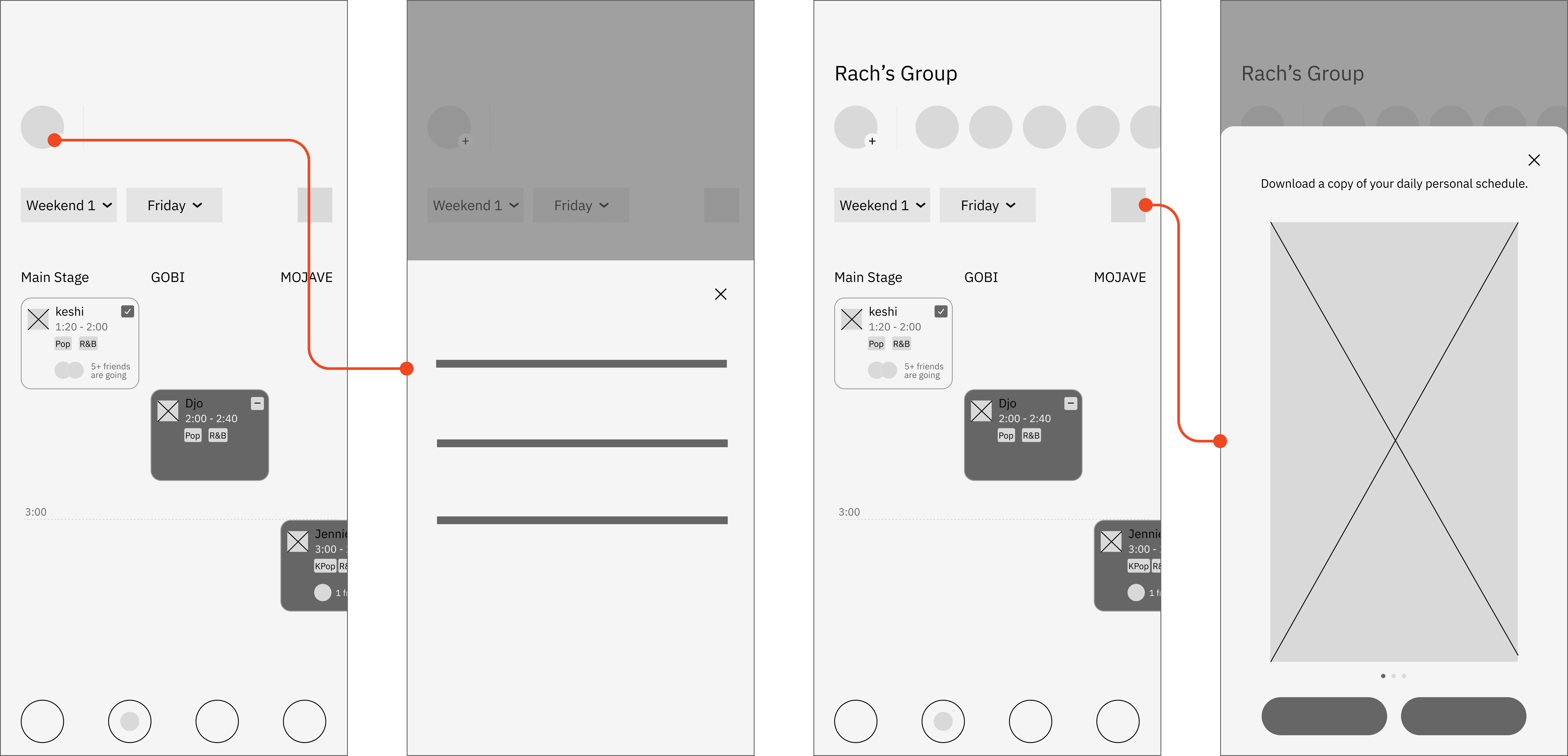
Our Solution


Retrospective
This was an incredibly exciting design journey. Coachella is a truly special, large-scale festival with eight stages, where 5–7 performances often happen simultaneously. Because of that, beyond considering music and artist-related content, the schedule became one of the most important parts of the design.
The calendar view, in particular, took a great deal of thought. At first, we considered the same approach many competitors use — with each row representing a time slot and each column representing a stage — so users could see each stage’s lineup at different times.
However, this layout didn’t work well on mobile. The width of a phone screen can only fit about 4–5 stages at a time, meaning users would need to scroll horizontally 1–2 times to see all performances for the same time slot. This made it difficult to compare shows at a glance and slowed down decision-making.
User testing confirmed this. Users overwhelmingly wanted to quickly spot schedule conflicts without switching back and forth between horizontal and vertical scrolling.
So, we took a different approach: using time as the primary vertical axis, allowing all performances in the same time slot to be displayed together in one view. This made quick comparisons and choices far easier — and became one of the key breakthroughs in our design.
Coachella is not just about music — it’s about encounters, laughter, and unforgettable moments with friends. My hope is that this app helps festival-goers plan their weekend more effortlessly, savor each moment, and create lasting memories.